ERSKINE ATTACHMENTS
Website & Rebrand
Erskine Attachments is a leading manufacturer of skid steer attachments, with products across multiple brands.
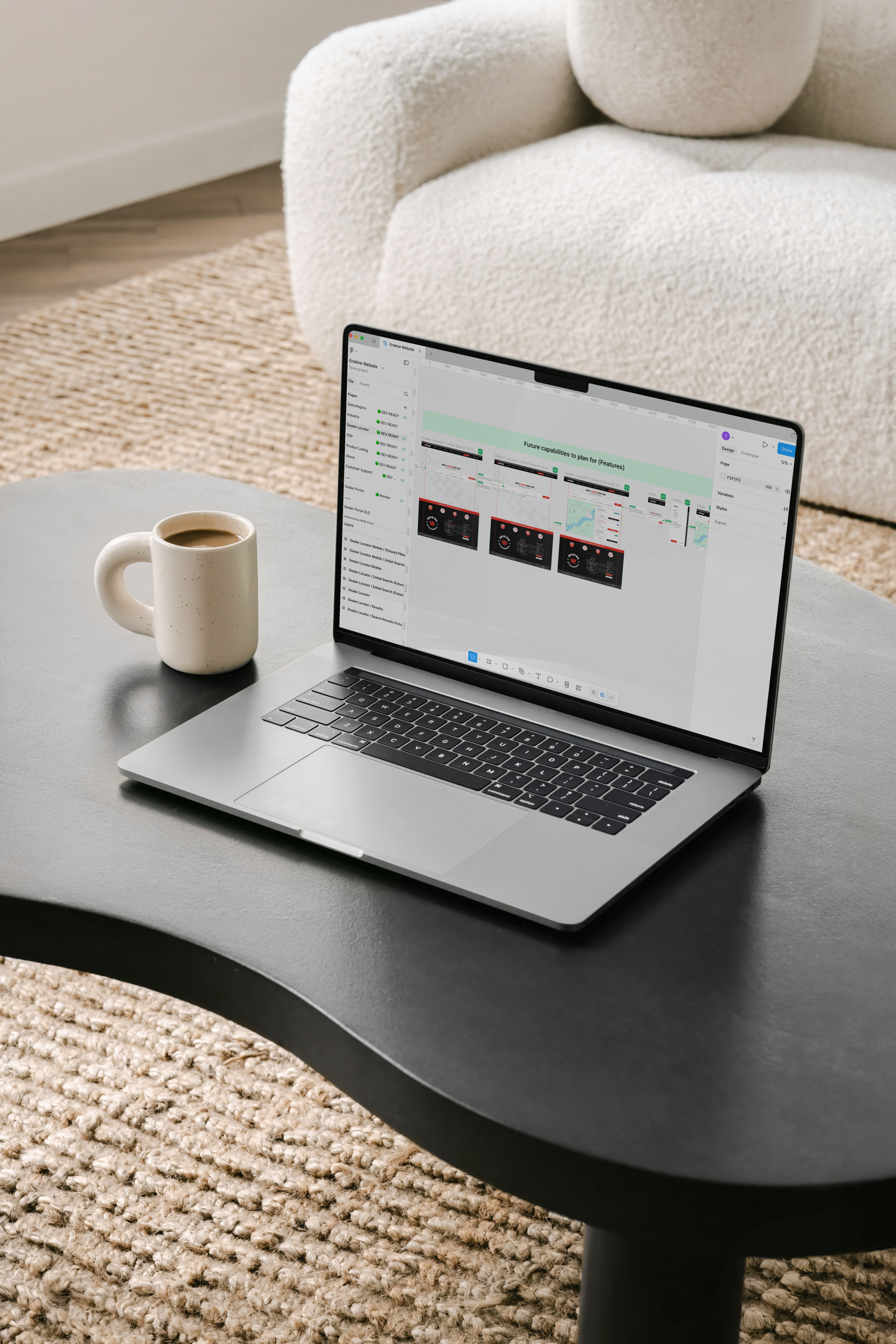
This website was the first step in reworking the digital experience, setting the foundation for how future child brand sites will be structured and designed.
THE CHALLENGE
Designing for a system that doesn’t stop at one brand.
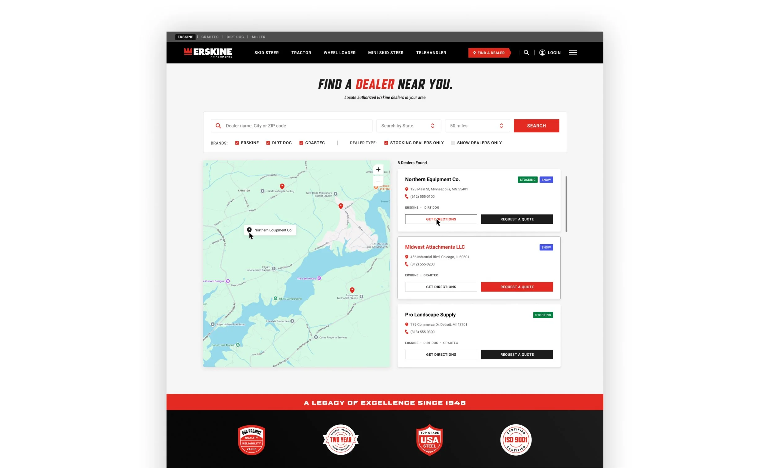
The Erskine website needed to support not only its own product catalog, but also act as a central hub for multiple related brands.
This introduced complexity in how products were organized, displayed, and navigated. Requiring a system that could clearly differentiate brands while still feeling unified.
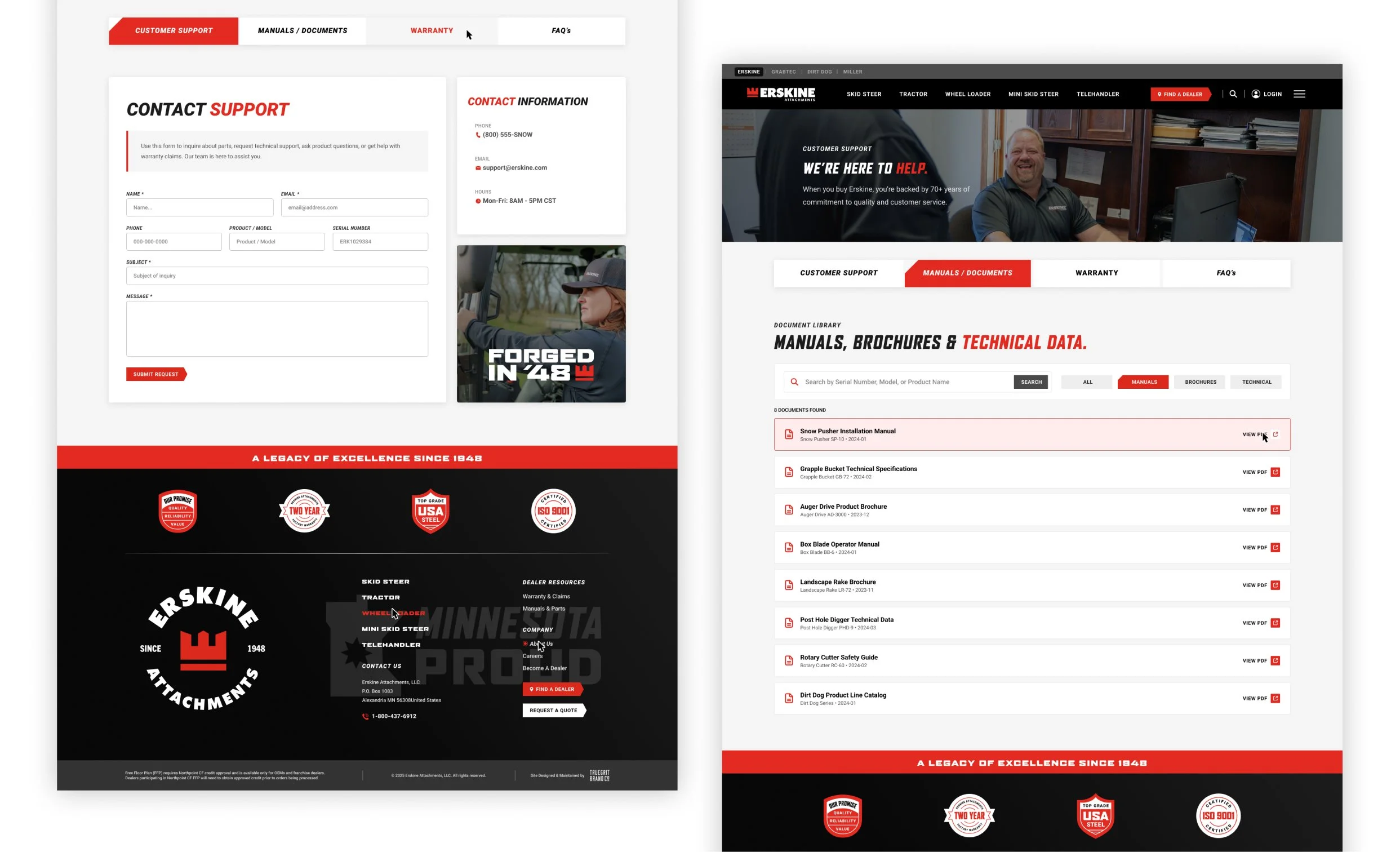
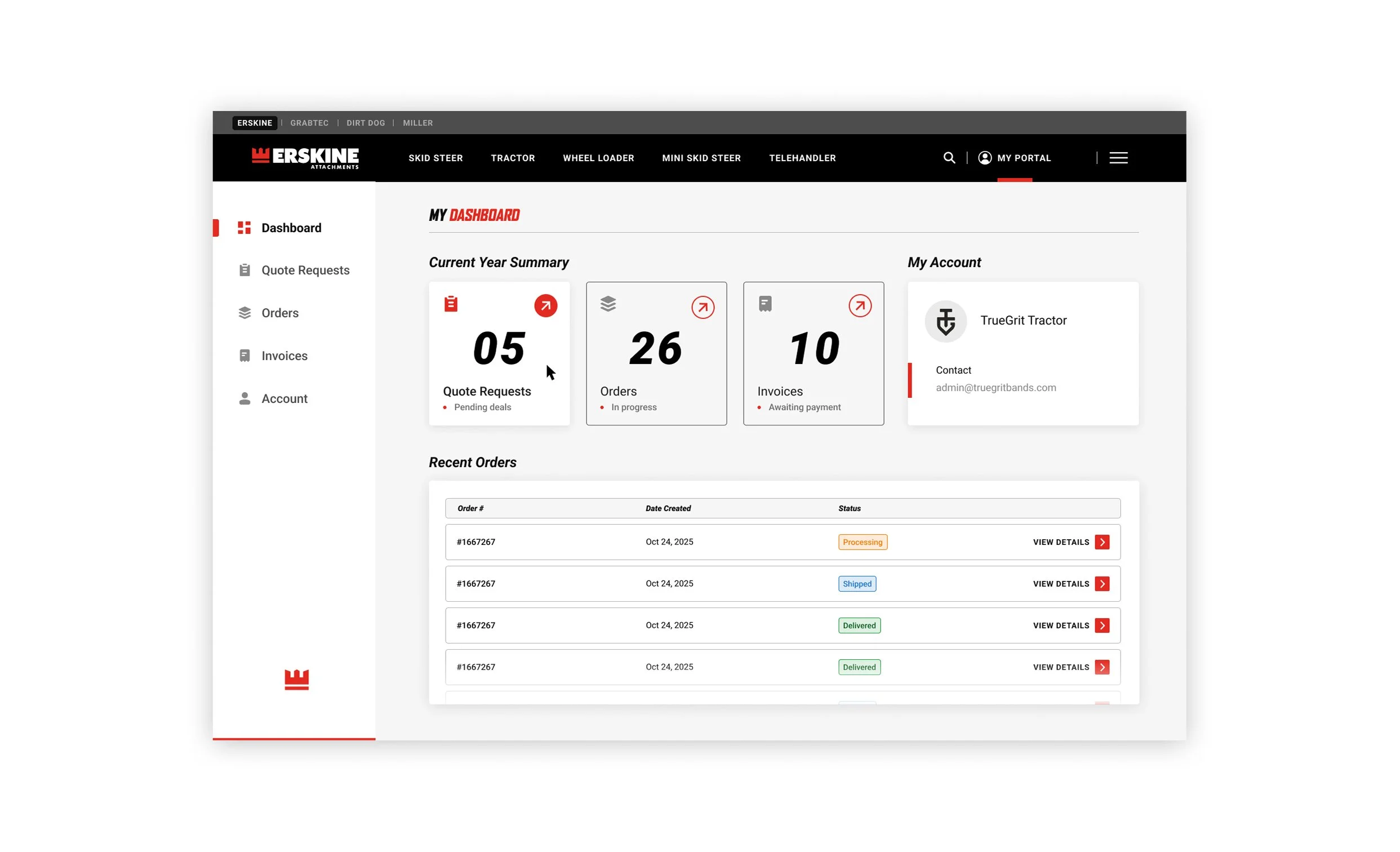
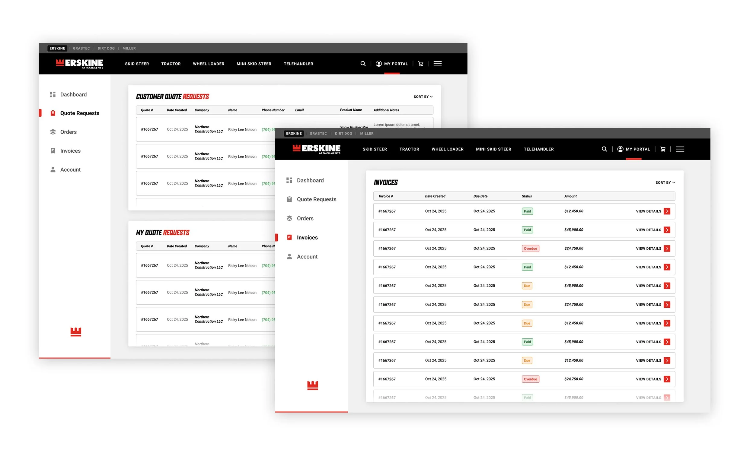
At the same time, the site needed to support long-term growth, including future plans for dealer and customer portals, quote requests, and potential e-commerce functionality.
THE APPROACH
〰️
THE APPROACH 〰️
Building with what’s next in mind.
The design was approached with flexibility and scalability at the forefront. Ensuring the site could evolve without requiring a full redesign.
THIS INCLUDED
structuring product pages to support future purchasing functionality
designing layouts that could accommodate additional user flows (dealer + customer portals)
maintaining consistency across a growing multi-brand family
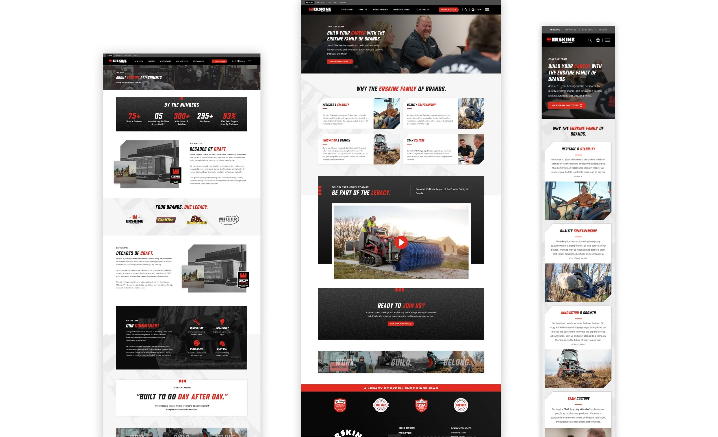
The focus was on building a foundation with the future in mind, something that can grow and evolve over time. It’s how I approach every website design.
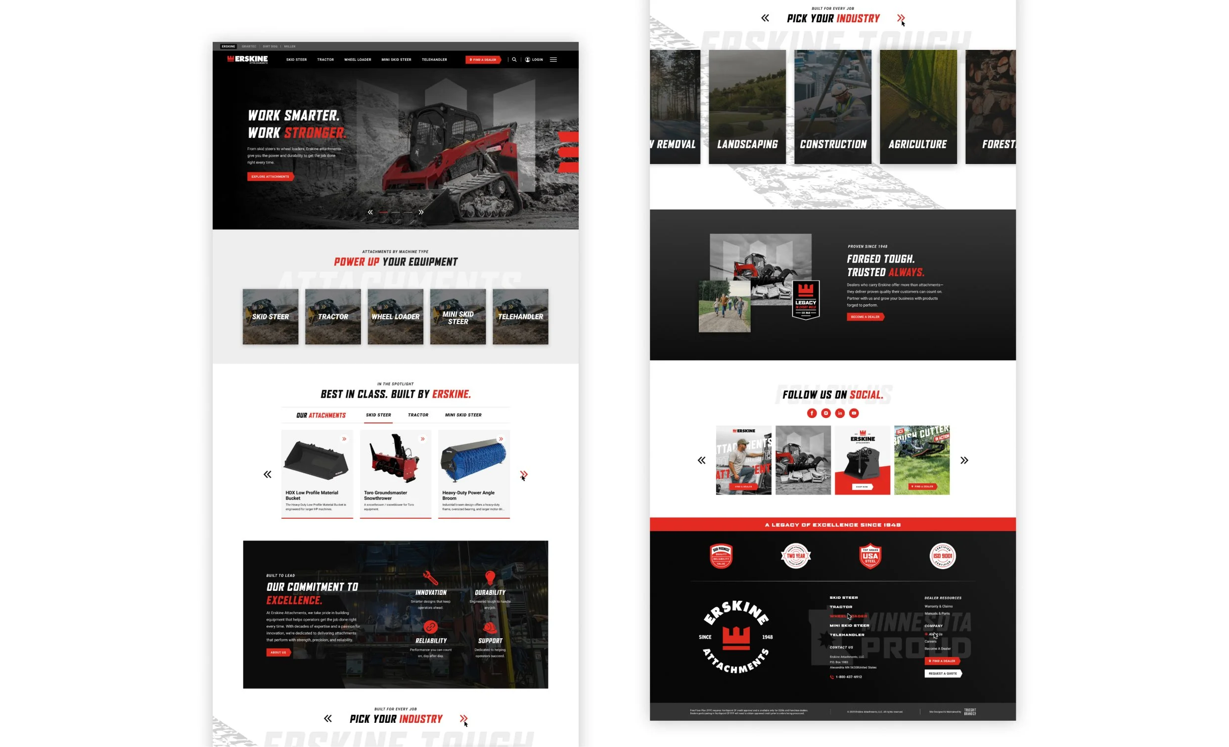
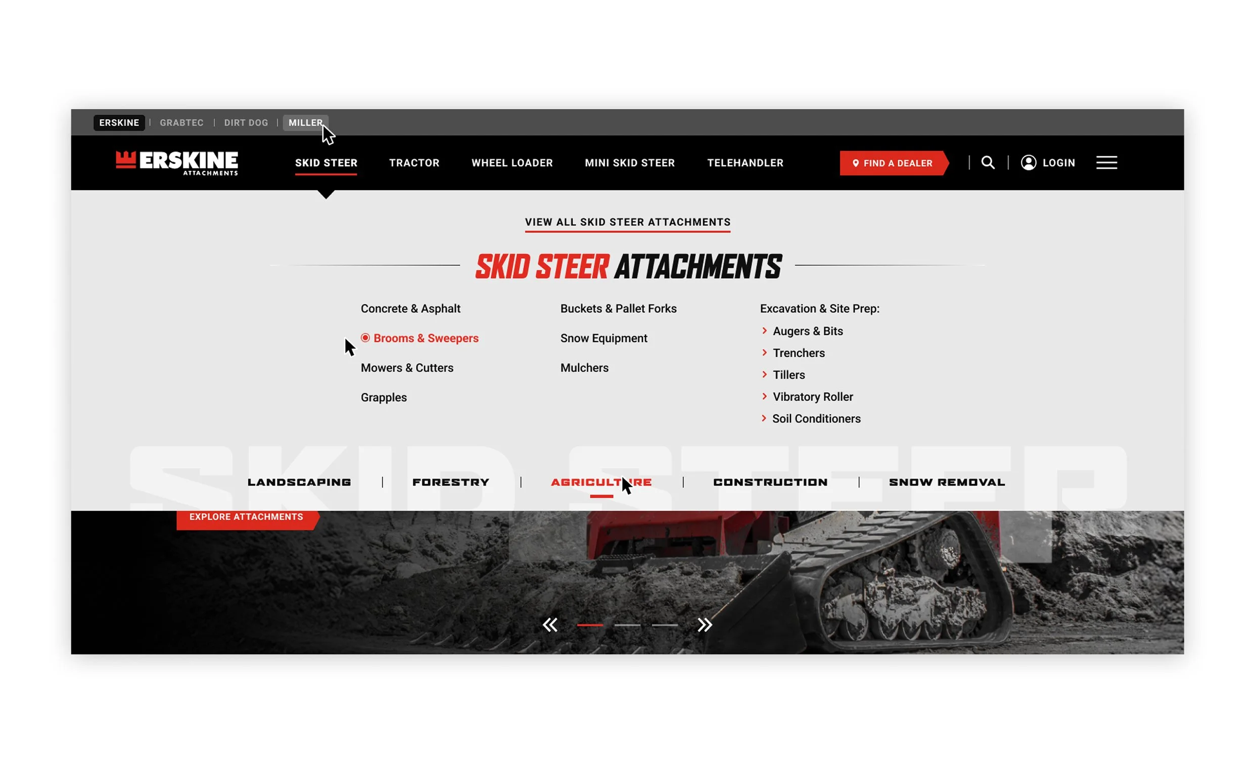
One system, multiple identities.
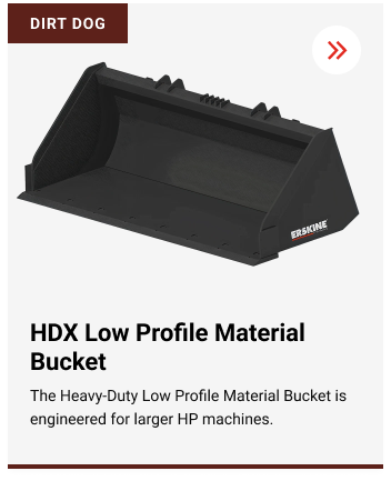
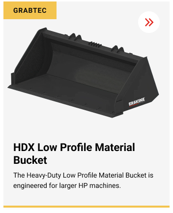
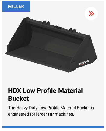
Because Erskine operates alongside several related brands, the experience needed to clearly communicate brand distinctions without fragmenting the user journey.
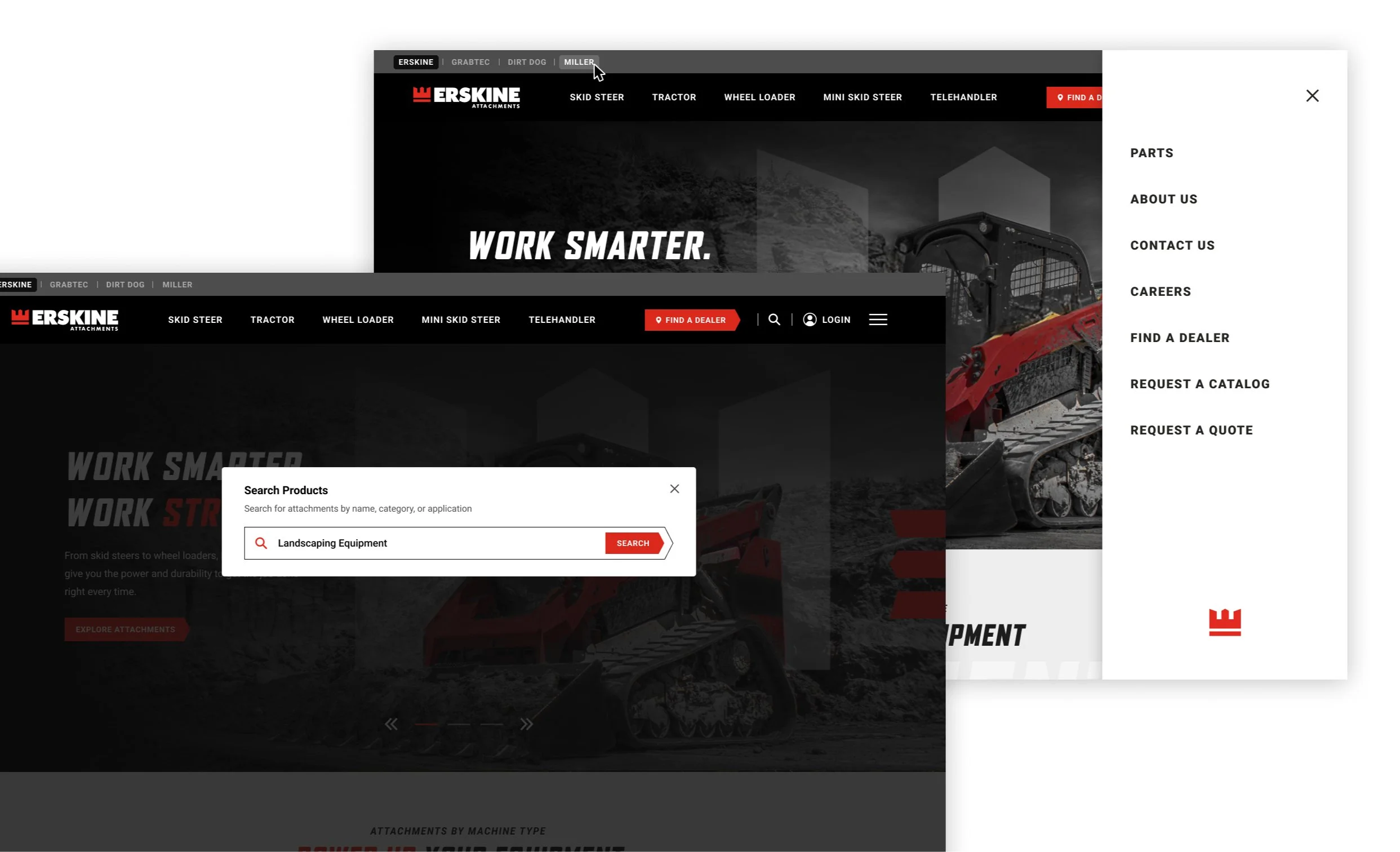
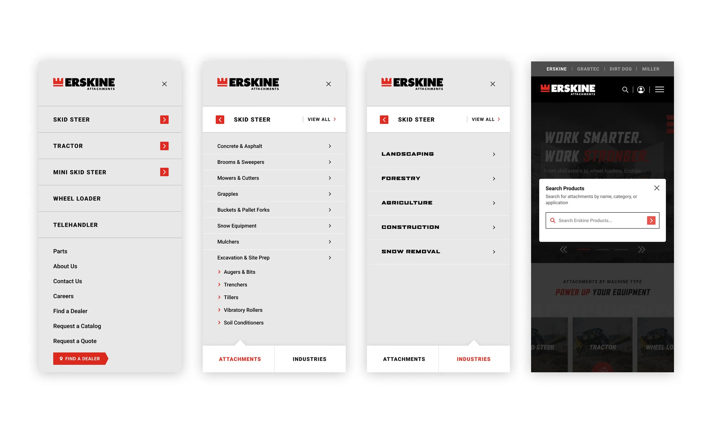
Navigation was structured to showcase these brands while keeping the primary experience centered on Erskine. Each brand is accessible from the top left of the navigation for quick access. A pattern that will carry into future child brand sites.
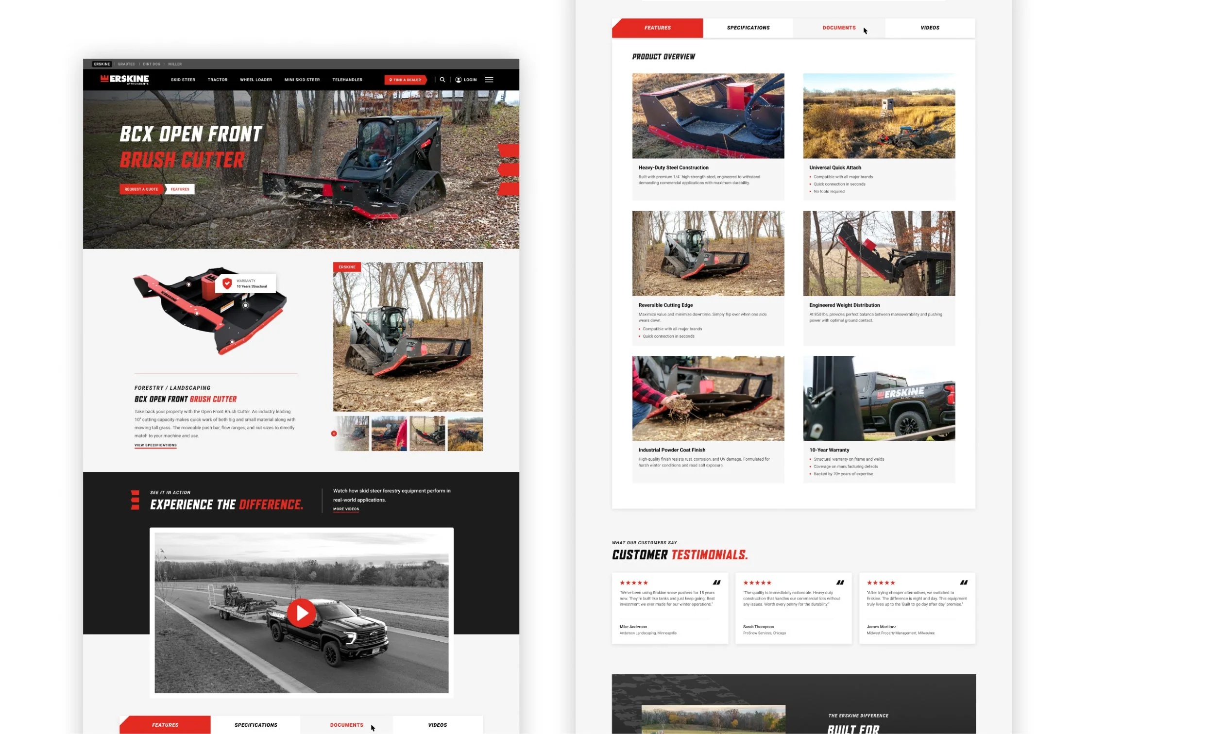
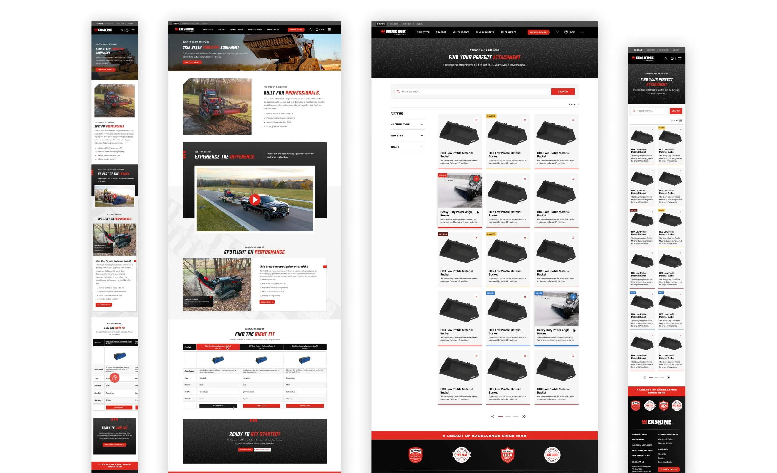
On product listing pages, products from different brands were integrated into a single system, with visual tags used to clearly identify their origin. This makes it easy to browse while still keeping each brand clear and distinct.
Making complex catalogs easier to navigate.
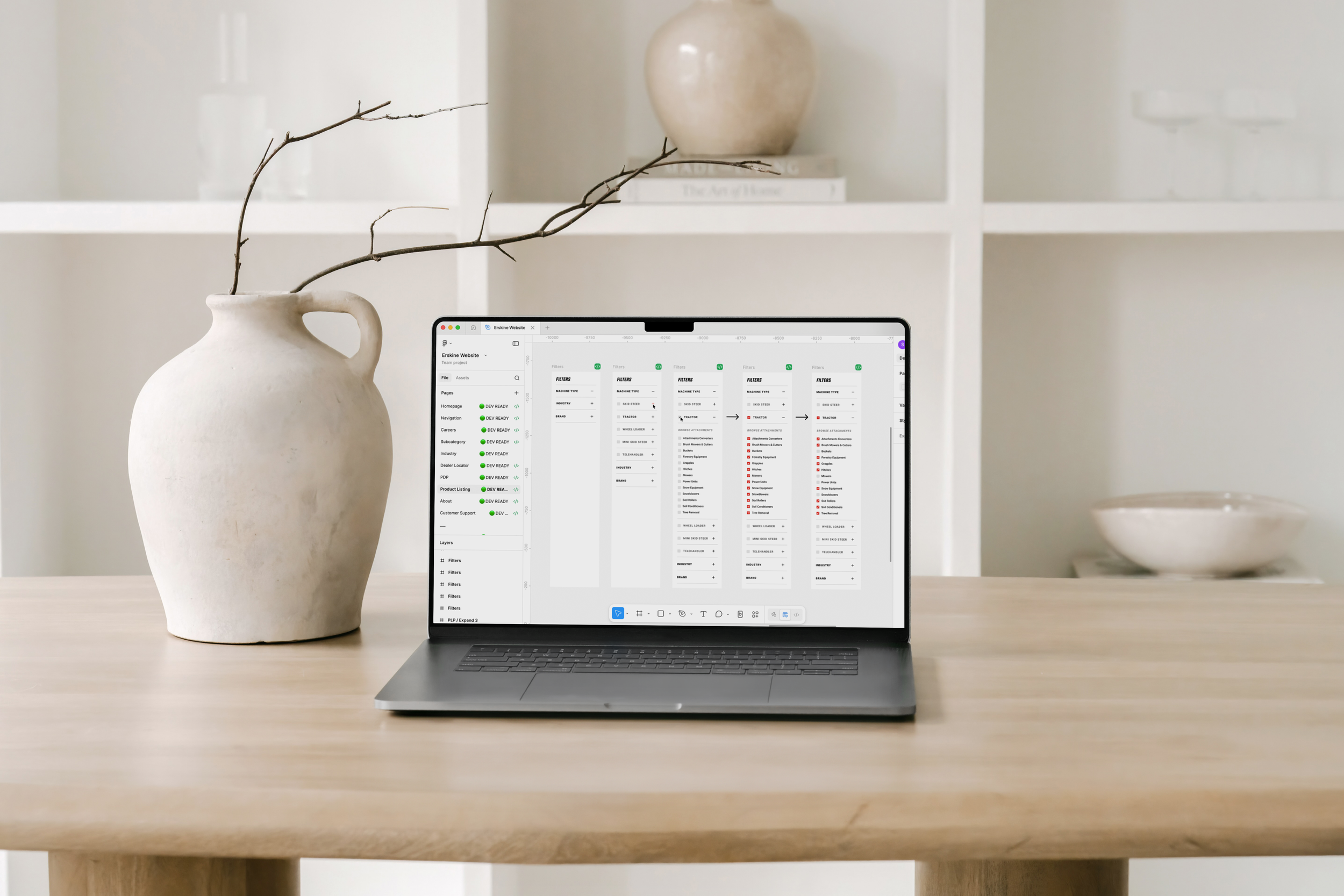
The previous experience made it difficult for users to quickly find the right product, so I focused on simplifying navigation and user flows and creating clearer category pathways to reduce friction.
Clear structure and consistent product cards help users quickly scan, while filters and categories make it simple to narrow in on what they’re actually looking for.
THE RESULTA more scalable, connected experience.
The redesigned site creates a stronger foundation for Erskine’s digital presence. Improving product discovery, unifying multiple brands, and setting the stage for future growth.